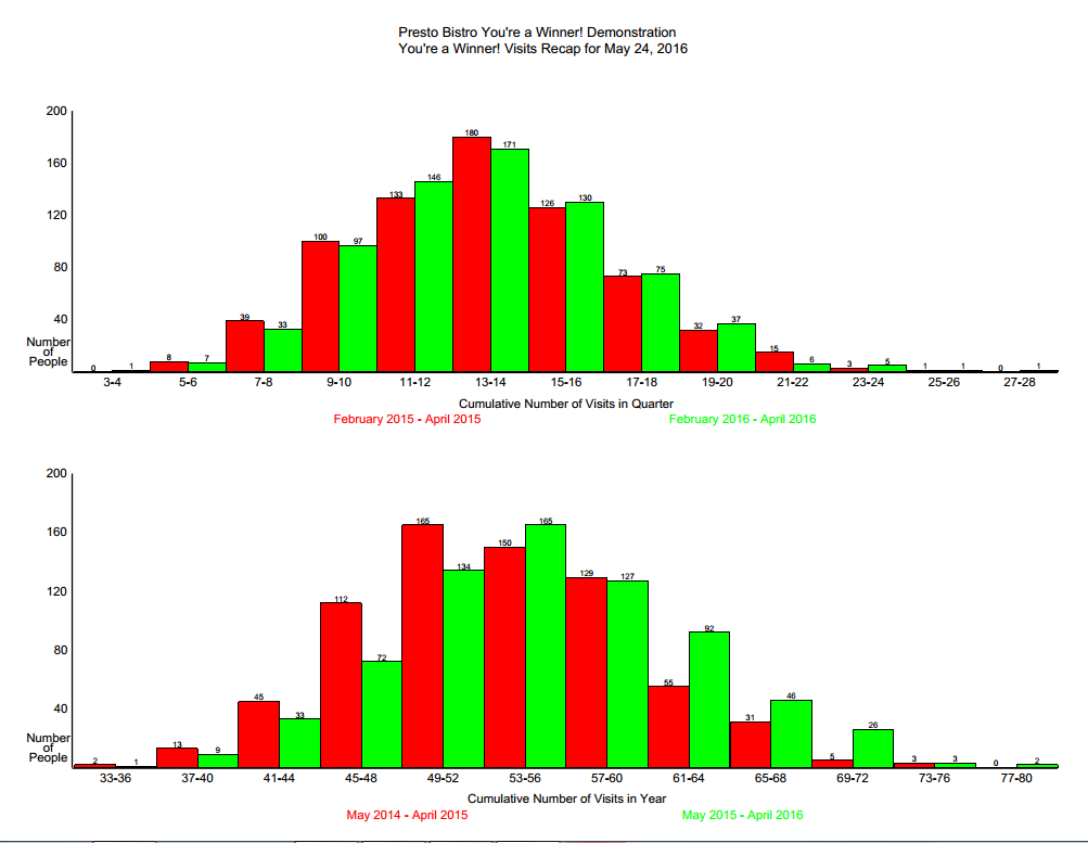
This page shows two graphs. The top graph shows the cumulative frequency of visits in the quarter for the most recently completed quarter. The height of each bar shows the number of individuals who have visited and (re-)entered the draw in the quarter. The bars represent the frequency of visits within the quarter. Note that because of the wider distribution of visits, each column represents an aggregation of different visit frequencies.
In this sample only one person visited between 3 and 4 times during the quarter while 7 people between 5 to 6 times, 33 people visited the facility between 7 to 8 times in the most recent quarter. Comparisons between the current quarter and the same quarter a year earlier are provided.
The second graph shows the cumulative number of visits by individuals in the year ending at the most recent complete month (April 2016, in green) and compares those numbers with the same period a year earlier (April 2015, in red). In this chart you can see that 134 people visited the facility between 49 and 52 times during the year from May 1, 2015 to April 30, 2016 (green column) compared to 165 people who visited the facility between 49 and 52 times in the period from May 1, 2014 to April 30 2015. 165 people visited between 53 and 56 times during the year ending April 30, 2016 (green column) while 150 people visited the facility between 53 and 56 times in the year prior, and so on.